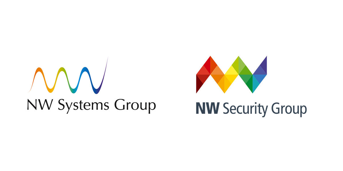
Old Logo vs New Logo

NW Systems Group, specialists in IP-based Video & Security Systems became NW Security Group and commissioned me to create a new logo and identity. The brief was to keep the essence of the logo with an update to make it stronger and bolder, and create a visual identity system around the new logo.
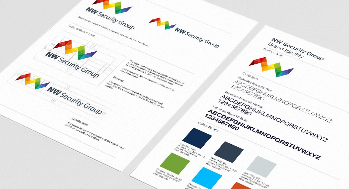
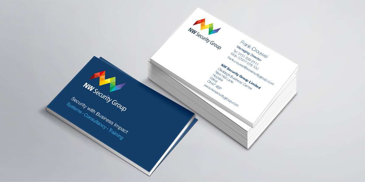
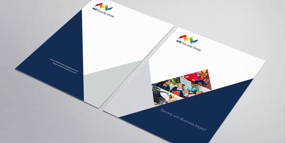
The shape of the symbol was originally inspired by the letters NW, this concept was partially maintained, with the triangles introduced as a reference to pixels and the digital technology that NW Security Group are well known for. The logo design was expanded into the identity concept using the pixelated triangles to create dramatic designs. The brand guidelines ensure consistency of application of this in-depth reworking of an identity that answers all the requirements.
"Having previously worked with Sharon, she was our first choice to take on our rebranding project following a change of company name. Sharon’s creativity really came to the fore during the design of the new logo and her subsequent work updating our brand guidelines, stationery and other collateral. The result is a refreshed visual identity that we’re all very pleased with." Paul Sandford, Marketing Manager, NW Security Group