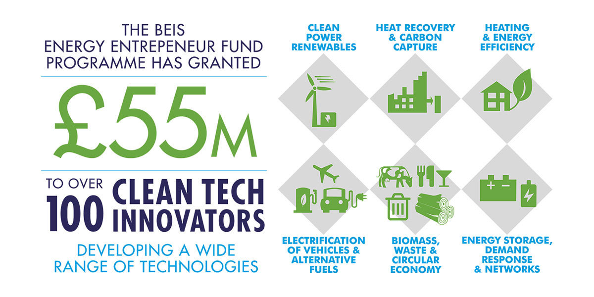
The annual Towards Successful Commercialisation Conference brings together industry, investors and government to engage with world-class entrepreneurs. Sharing best practice to commercialise leading edge sustainable technologies.
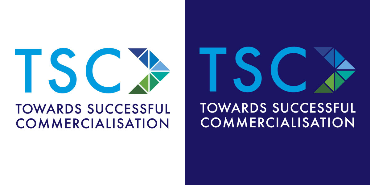
The new logo is comprised of a symbol and a wordmark. The symbol uses an arrow that alludes to the fund’s key aim of helping sustainable tech businesses move forward commercially. The arrow has been developed into a dynamic graphic that sets the tone of the conference.
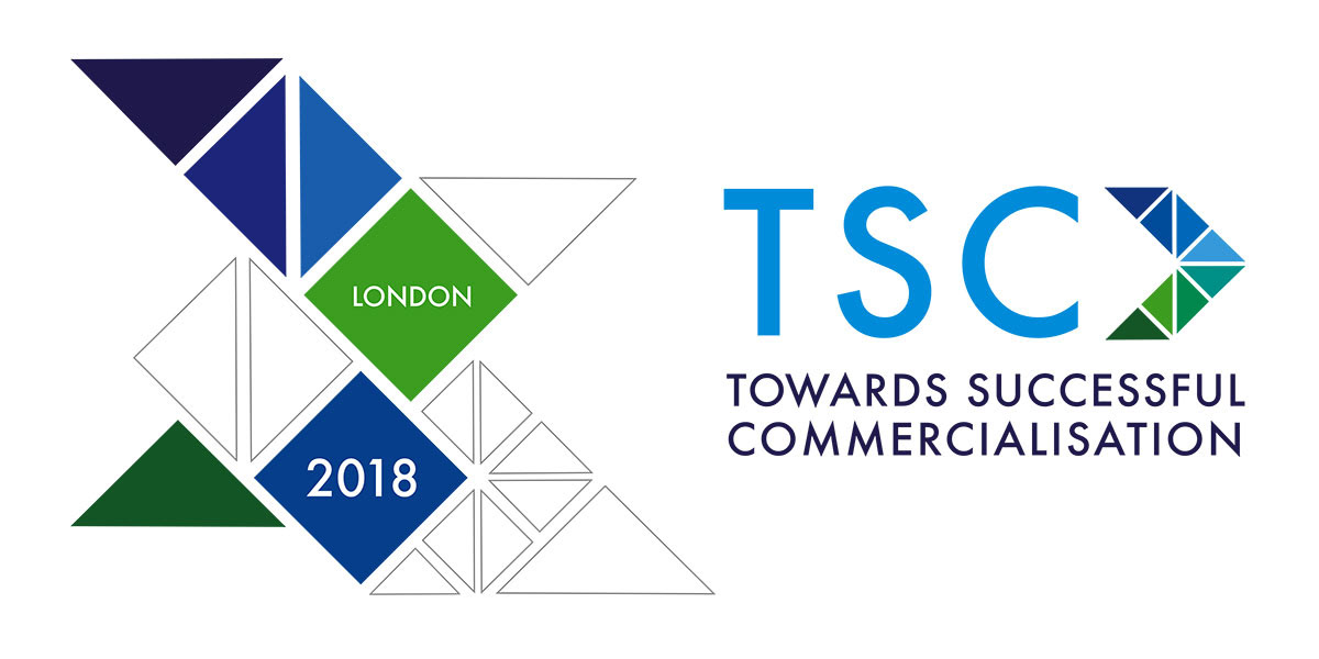


Added to the identity are blues and greens, the colours of sustainability and a clear bold font whose simplicity and openness hints at transparency. The identity expresses the brand’s ethos of partnerships to propel sustainable technologies to create a cleaner, brighter future.
"Sharon worked with us to create branding and a website for a UK government-sponsored event for their flagship Energy Entrepreneur programme. The aim was to use the website to raise the profile of the event. Sharon understood the brief well and came up with a striking design that captured the essence of what we were trying to communicate. Overall, she delivered a professional, flexible and effective service which helped to support a successful event." Natalie Fredericks, CLT.