
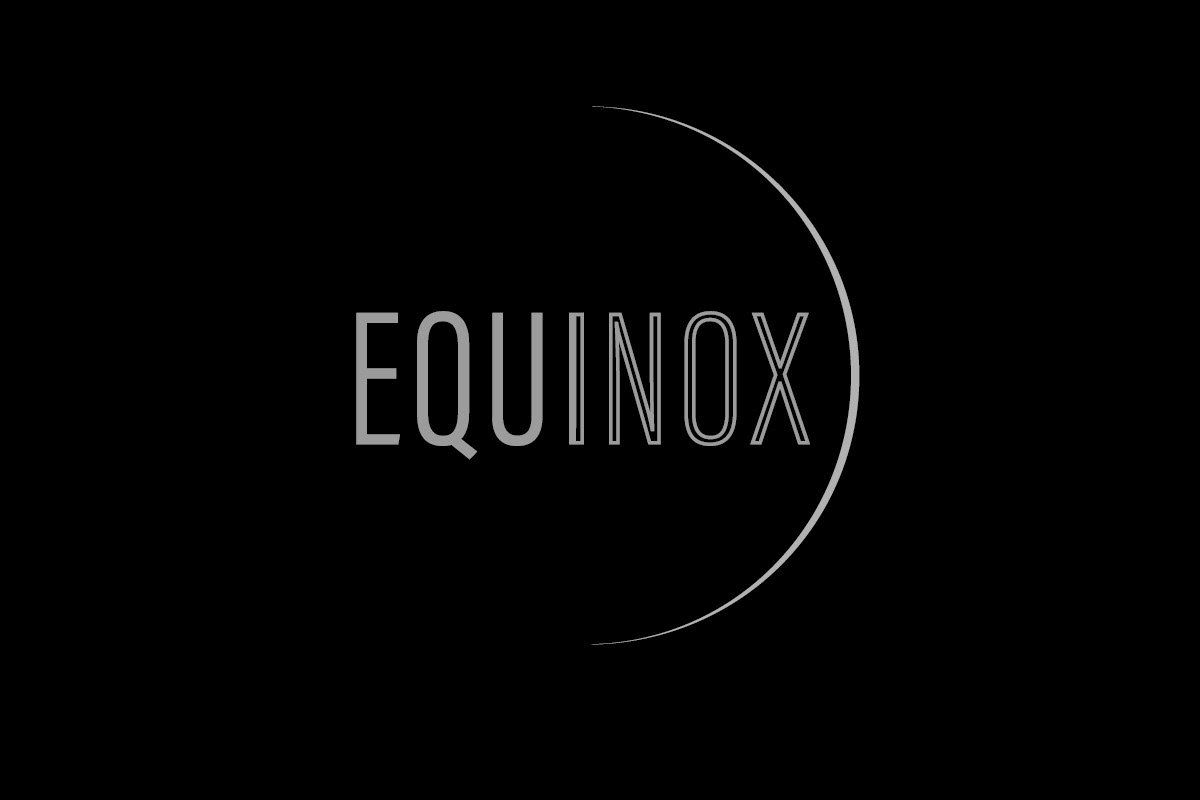
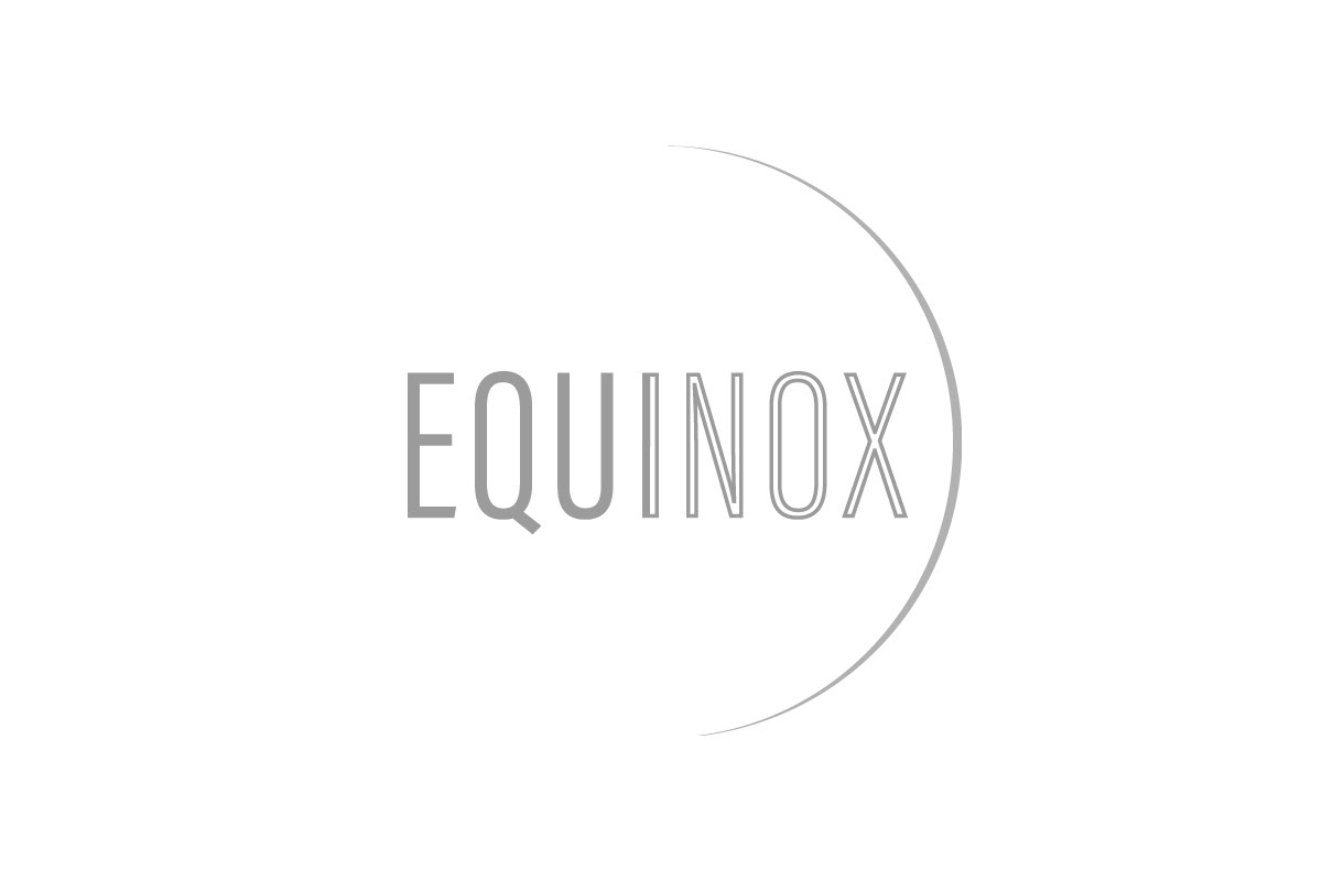
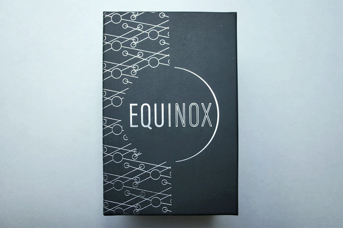
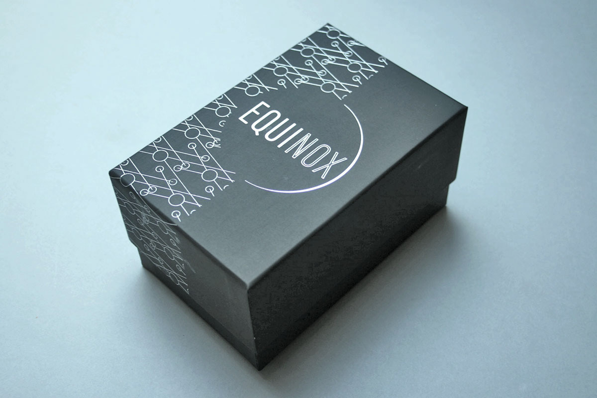
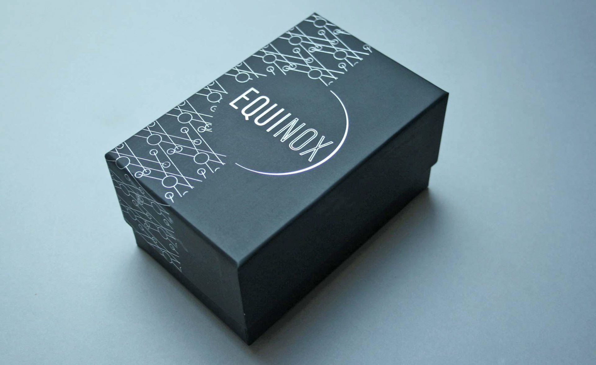
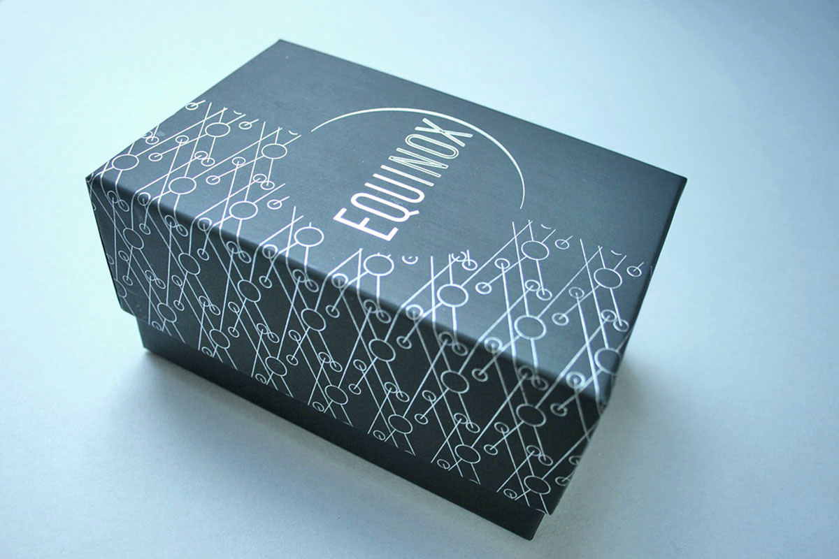
Equinox were looking for branding that would capture the meaning behind the business and the name, and appeal to their target market. I designed their logo, packaging, business cards, and managed the packaging creation and print. The design inspiration is based around the astronomical event, equinox, in which the plane of the Earth’s equator passes through the centre of the Sun which occurs twice each year.
"Amazing results! From our first meeting Sharon hit the nail on the head with what we were looking for, we were so impressed we didn't have any quotations from other companies. Sharon designed our logo, labels, business cards and our packaging. I am so thrilled with all that she has designed. She has captured the meaning behind the logo and appealed to our target market. Sharon is also a great problem solver; her suggestions for the packaging have worked out very well and saved us a lot of money. Sharon has gone above and beyond our expectations, she is also very friendly and easy to talk to, I often call her with little updates about our business and have a catch up. We have been working with Sharon for 11 months now and I wouldn't have anyone else!" Georgina Highfield, Equinox