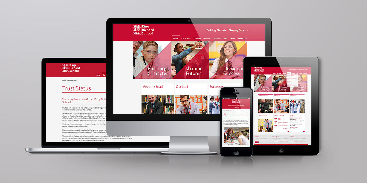
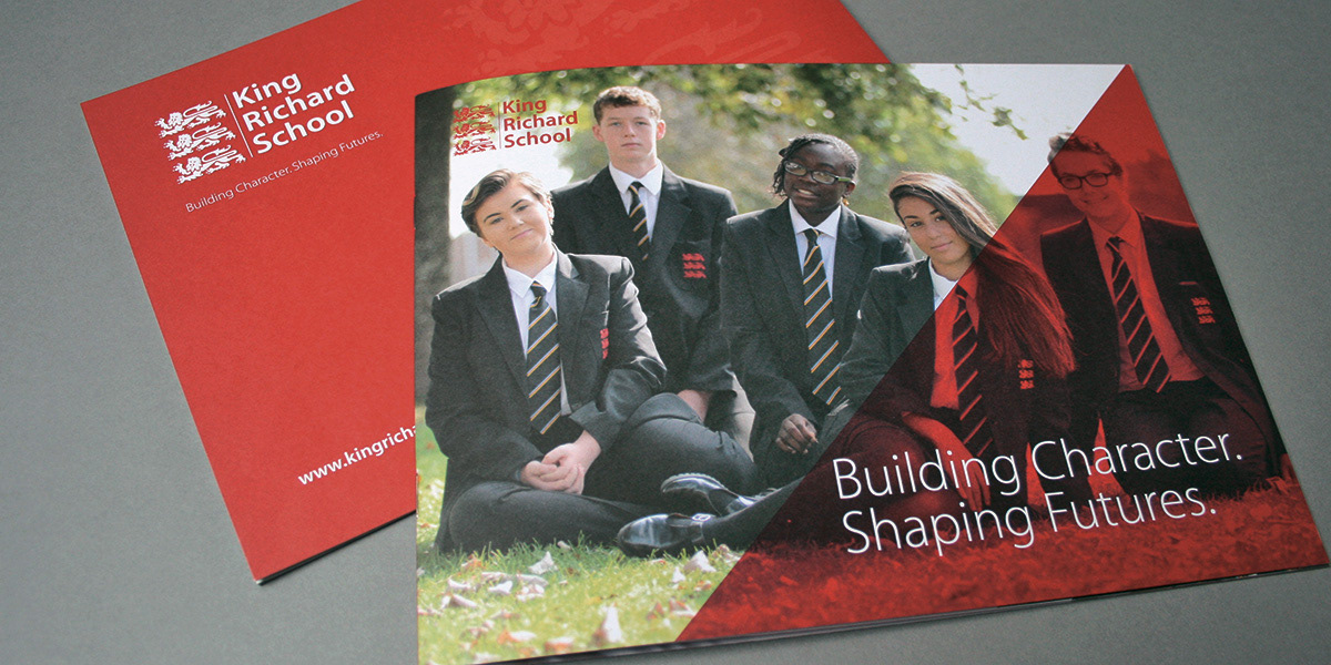
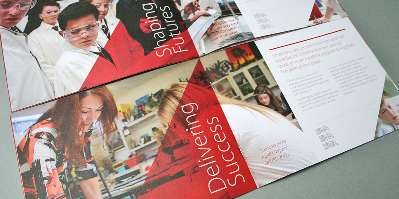
The purpose of the new school identity, prospectus and website is to portray the changes and improvements in the school. For students, teachers, parents and the community to ‘take another look’ at the school and get a more positive and accurate impression.
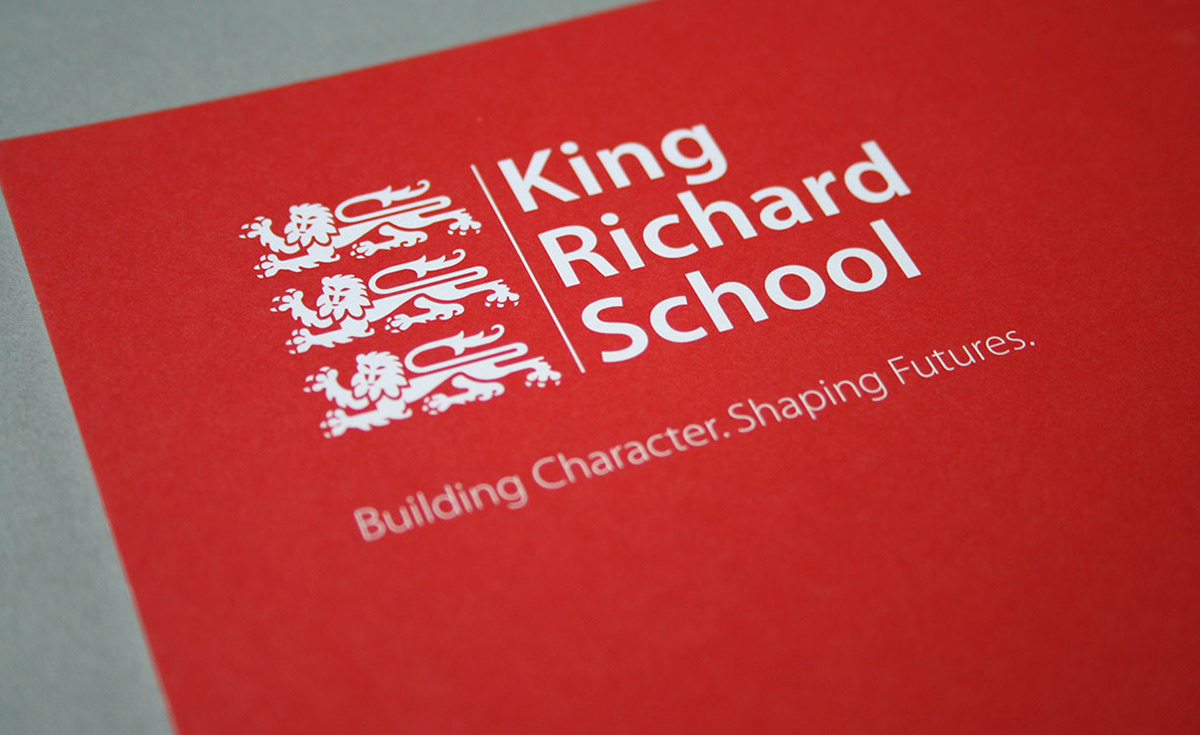
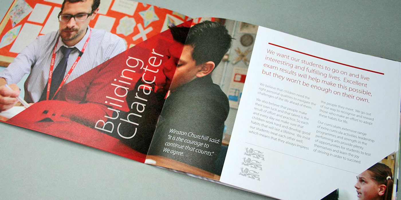
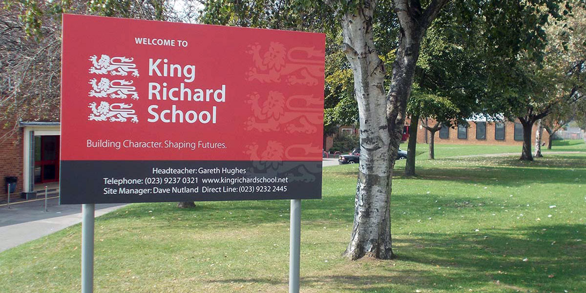
The identity I created is about traditional aspects of professionalism, order and respect, but with a human focus. The colour red and the 3 lions are the schools’ heritage, the red indicates passion and excitement.
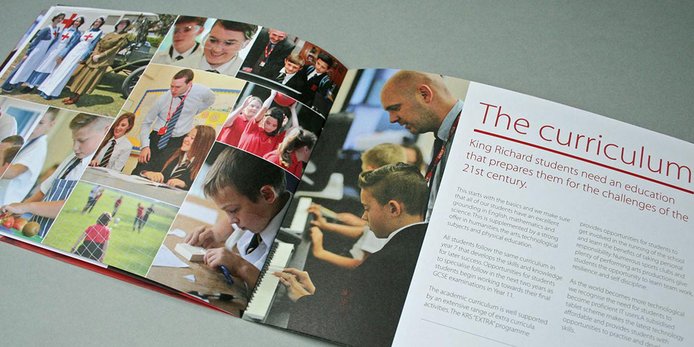
The photography focuses on the students and teachers and their positive emotions and interactions with each other while involved in school classroom and other activities. The font is a classic sans serif with well balanced letters and spacing. It has a perfectly rounded ‘o’ that expresses a friendliness with an orderly, professional appearance. The use of upper and lowercase communicates approachable and down to earth.
This was then implemented across all communication, internal and external, for a unified image and message.
"Sharon gave us personal service, individuality and creativity, attention to detail, technical expertise and value for money. The results are a really individual identity well matched to the values of the school. Excellent alignment of all outputs. We are thrilled." Gareth Hughes, Headteacher.